
Aesthetics in design is skin, and skin is an organ
We spent years fighting the UX/UI designer label because it sounded shallow. We were partly wrong about why.
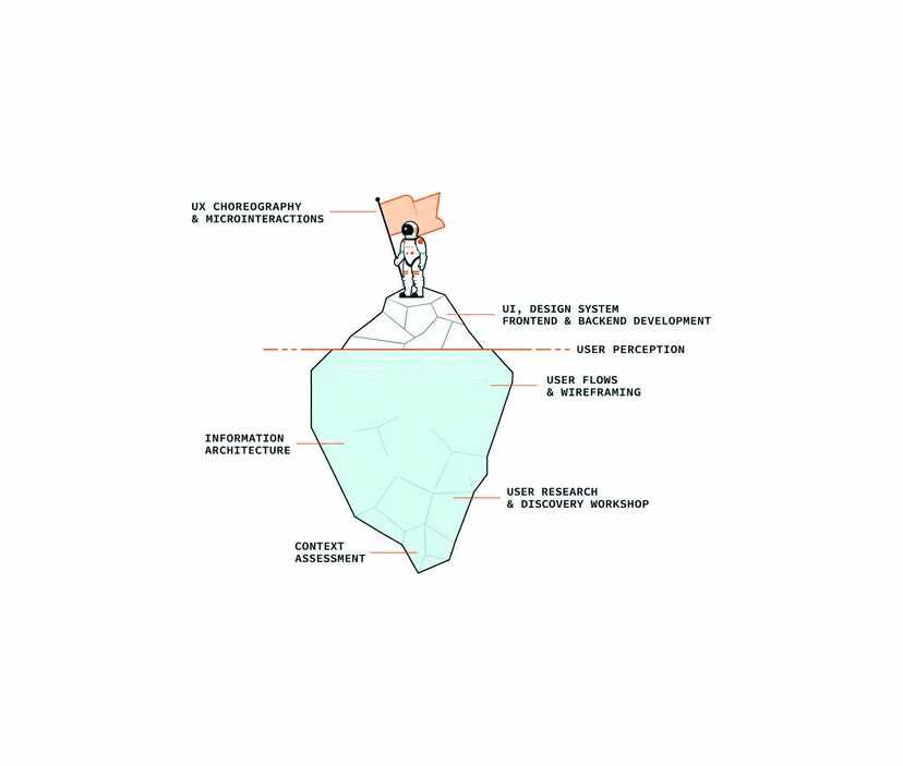
For years, in Italy, a lot of us fought against the job title "UX/UI designer".
It sounded like a person who makes screens pretty after the real decisions have been taken somewhere else, and we wanted the market to understand that design is strategy, research, systems, responsibility.
We lost that battle: the title is on every job board. Looking back, I think we also argued it badly, because we let aesthetics in design stand for something shallow when it was only ever superficial, in the oldest sense of the word.
The iceberg we used to explain ourselves
On the "about us" page of NOIS3, the agency I founded and ran for about fourteen years, we had an iceberg. A dashed line runs across it, labelled user perception.
Above the line: UI, design system, frontend and backend development, and at the very tip UX choreography and microinteractions, where a little astronaut plants a flag.
Below the line, most of the mass: user flows and wireframing, information architecture, user research and discovery workshops, and at the bottom, context assessment.
We used that drawing to say that the important work happens underwater. It was true, and it was also convenient, because it let us talk about the visible part as the least interesting one. I never thought UI was unimportant.
But in the drawing it sat there like a thin layer of paint on top of the real thing, and that is how most people read it, including me on a bad day.
Superficial comes from anatomy
Here is what I got wrong. In English, "superficial" entered the language in the late 14th century as an anatomical term, for something located at the skin's surface instead of deep in the body.
The figurative meaning, thinking that never gets below the obvious, came a few decades later. In Italian, "superficiale" still carries both meanings in one word, and I suspect that is part of why the debate in Italy got so heated: when someone called UI superficial, we heard "shallow" and got defensive.
The anatomical meaning is the one worth keeping, because it turns the UI into the skin of the system, and skin is a far more interesting thing to be than paint.
Skin is the largest organ you have
Skin is the largest organ of the human body, around 15% of total body weight and roughly 20 square feet of surface on an average adult. It protects you and keeps your temperature in check, and it is also where the rest of the body shows up.
You can treat it from the outside as much as you want; healthy skin is still largely a consequence of a healthy body underneath.
Interfaces work the same way. You can polish a screen indefinitely.
If the information architecture is confused, if nobody ever talked to the people who will use it, the polish shows the confusion instead of hiding it.
And when the system underneath is sound, excellent craft does something specific: it takes all that complexity and reduces it to a handful of gestures, a few visual, interactive and aesthetic choices that make the right concept readable at a glance.
That reduction is the hard part of design craft, and it is the part people mistake for decoration when they only see the result.
Pixel pushers did the rest of the damage
The other half of the problem was us. In Italian we call them sposta pixel, people who move pixels around. If your work starts when the brief lands and ends when the file looks right, if you open Figma before asking who will use the thing and why, you are doing skincare from the outside only.
You are also handing every client who thinks UI is decoration the proof they were looking for, and the label then sticks to everyone, including the people doing the work underneath.
I have nothing against moving pixels.
A pixel is where a long chain of decisions ends up: the research that told you who you are designing for, the architecture that decided what goes where, the flow that decided what happens first.
My problem is with the designers who stop there and treat the question "why is it here?" as somebody else's job. That habit got a lot more expensive with AI, because the part above the waterline is exactly the part a model can now produce in seconds.
Then AI arrived, and the pixel pusher’s job description got handed to software. The pixel pushers now are Claude Design and friends: Figma Make, v0, Lovable and a growing list of tools that take a prompt and return a screen with sensible spacing, a decent type scale and a palette that does not hurt. They push pixels faster than any junior I ever hired, and they never ask why the button is there either. If moving rectangles until they look right was your whole job, that job is going away, and a good part of it deserved to.
AI is also revising the surface layer itself, the one this whole argument is about. My font tool returns a pairing, a type scale and the CSS in seconds; agents inside design tools remap every variable of a library in a fraction of the time it used to take. The skin has become the cheapest layer to produce, and because it now comes out polished regardless of what sits underneath, a wrong concept looks finished on day one. None of these tools will stop and ask whether this is the right thing to make. That question stays with the designer, and it changes what the job looks like.
Engineers already have a name for the work around an AI agent: harness engineering. The agent is the model plus everything around it, the context it reads, the tools it can call, the guardrails that limit it and the checks that catch it when it drifts. The design version of that is what I call a harness designer. You stop pushing the pixels yourself and design the harness the new pixel pushers run in: the research that says who the screen is for, the information architecture, a design system and brand rules that define what good looks like for this product, and the review that decides what ships. Seen from here, everything below the waterline in our old iceberg is exactly what you hand to the machine as constraints, before you let it run.
Beauty carries meaning, including the wrong one
There is a well known study behind this. In 1995 Masaaki Kurosu and Kaori Kashimura at the Hitachi Design Center tested 26 ATM interface layouts and found that the ones people rated as more beautiful were also rated as easier to use. It later became the aesthetic-usability effect, one of the entries in Jon Yablonski's Laws of UX.
People usually quote it as an argument for beauty. I read it as a warning too. If aesthetics changes how usable something feels, then aesthetics is a carrier: it delivers whatever concept sits under it with more conviction. A beautiful interface on top of the wrong idea will sell the wrong idea better. The skin matters a lot, then, though its value depends on what it is attached to.
A font tool born from the same tension
This has been bugging me for a long time, and it came back last week because of a small thing I built. I published fonts.ekitai.io, a font pairing tool, because I have spent my whole career between two requests that sound almost the same and pull in different directions: "I want something very beautiful" and "I want something that works". Font pairing is where I always felt that split most. You can pick two typefaces because they look good together on a mood board, or you can pick them because their x-heights, contrast and roles hold up in a real page.
The tool tries to make the second path explicit. It treats a pairing as a relationship you can explain: an anchor font, affinity and contrast with the second one, roles, a type scale, WCAG 2.2 checks, all shown in a page layout instead of isolated samples. I am honest about its limits on the site itself: the x-height values are estimates, good for diagnosis, not certified metrics.
The Jenga tower
When I published it, Boardy, the AI that matches people for introductions, put me in touch with Jeremy Oudit, a senior designer in Canada with about 25 years of experience.
He was laid off right before AI really took off, and he told me how recruiters kept asking him whether he had "AI experience" when the tools were new to everyone. Now he is employed again, and he used AI agents to push a design system overhaul through in a week that would have taken him a year: the bulk work, like remapping variables, the work that used to need focus and patience more than judgment.
He also told me about the booth he was building for his company's internal conference, to explain the value of design to people who do not do design. The centerpiece is a Jenga tower.
Every block carries a different design concept, engraved with a laser engraver he had never used before. Next to it, a spinning wheel that pulls a random principle from Laws of UX. The message is simple: pull too many blocks out of the design process and the whole thing comes down.
The original idea came from Danielle von Massow, and her version is sharper. Build your current design process as a Jenga tower.
Then challenge each other to remove every block you think is not needed, one at a time, until the tower falls.
I like this more than my old iceberg, and I told Jeremy so.
The iceberg says there is a lot of mass below the line, which is reassuring and slightly smug.
The Jenga tower asks which pieces are load-bearing, and the only way to find out is to pull them. It also admits something the iceberg hides: some blocks really can go. Jeremy's variable remapping is one. A good part of what we used to call process was ritual, and AI is removing it quickly.
What I do not have is the list. I cannot tell you in advance which blocks hold the tower up in your organization, and I distrust anyone who says they can. The skin is a good example. It looks like the easiest block to pull, because AI can generate ten polished screens before lunch. Pull it, and the concepts underneath lose the layer that was carrying them to people.
Doing things right, or doing the right thing
So my position has moved. I still think the UX/UI designer title shrank the profession in Italy, and I still think most of the value sits under the waterline.
But aesthetics in design is skin, and skin is an organ: large, essential, the place where meaning reaches people. It needs the right concepts underneath, otherwise it carries nothing, or it carries the wrong thing beautifully.
Making things well was never the goal on its own. What a project needs is everything necessary to make the right thing, and the surface belongs in that set. Try the Jenga exercise with your own process. Write your steps on blocks, start pulling, and watch which one you hesitate over.